
Color guides: Plus Series CMYK set, Plus Series Color Bridge set, and GoeGuide coated
Software: Color Manager for Mac v.1b3, myPantone v1.5
Company: Pantone
Prices: CMYK $125; Color Bridge $209; GoeGuide $79; software inc. ($49.95 separately)
The “African Chips” illustration (below) is from Tones by PANTONE 1.01 newsletter

In 1961 Johnny Cash wrote Forty Shades of Green, a sentimental song that is still played wherever Celtic cowpersons gather to slake their thirsts. Today, almost half a century after the song was written, your Mac can display millions of colors and forty no longer seems a big number. If you take color seriously, either professionally or vocationally, at some point you will have to address the question, “Which forty greens?” — perhaps not exactly that question, but something similar. To give a meaningful answer you will need to speak a color language, and that means you will need to choose a color system.
Introducing the color system products:
There are several color systems available, but Pantone is the most widely known and used. Lawrence Herbert, the founder of Pantone, introduced the Pantone Matching System in 1963, the same year that Johnny Cash released his ballad on the Ring of Fire album. The Pantone company became part of the X-rite corporation in 2007 and now encompasses a huge range of color products, including measurement hardware. We reviewed the latest generations of the original Matching System, the new Pantone Plus Series CMYK and the new Color Bridge Series in both coated and uncoated variants. The GoeGuide coated product is a new departure — Goe is pronounced “go” and salutes the color writing of Johann Wolfgang von Goethe who published Theories of Colors in 1810. The Color Bridge and GoeGuide products are responses to advances in printing and display technologies and the growing need to use more color steps and operate across computer monitor (additive aka transmissive aka RGB) and print (subtractive aka reflected aka CMYK) color environments.
We also looked at the Pantone Color Manager software for Mac, which was announced in mid 2010 and is still in beta. A Windows version of the software will be available at a later date, suggesting that in some traditional areas of supremacy the Mac platform still rules even as it moves towards a growing acceptance in new areas. To round out the review we checked on the myPantone palette software.
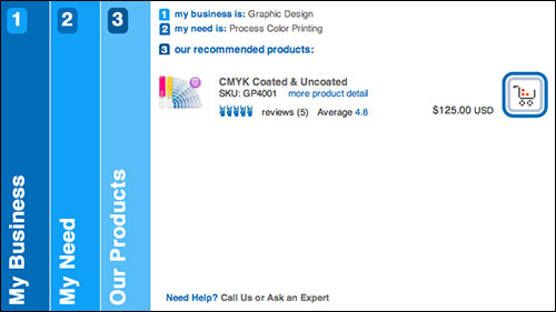
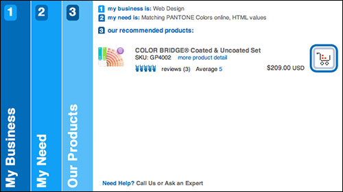
There are many niche solutions from Pantone, but there is a good chance that unless you already know the product you need then one of the two mainstream Plus Series guides we review here will fit your requirements. Before you are overwhelmed by the range of Pantone products and a plethora of names that may be less than intuitive for you, we suggest you visit the Pantone website at PANTONE.com and use the product finder. The finder is a simple three step process (but one that thankfully allows the user to step back as well as forward) and will quickly take you to the product most applicable to your area of interest. The steps are “My Business,” “My Need,” and “Our Products.” See below for two possible “Is this you?” results that recommend two of the reviewed products:
A closer look at the individual products:
The Pantone Plus Series CMYK coated and uncoated set contains CMYK colors chromatically arranged, so they are suitable for users whose work involves process color for printing. If that already includes you, but you are reluctant to follow the manufacturers recommendation that you renew your product annually, then check out the Chip In exchange program. Equipped with this pair of fan guides you will be able to check if the color you specified in your print file is the color that came off the press. Every Plus Series fan book has a ColorChecker Lighting Indicator built in, and although that is no substitute for a calibrated viewing box, it will at least give you support for your strongly expressed refusal to view your proofs in the dim yellow glow of a 40W bulb that has illuminated better days.
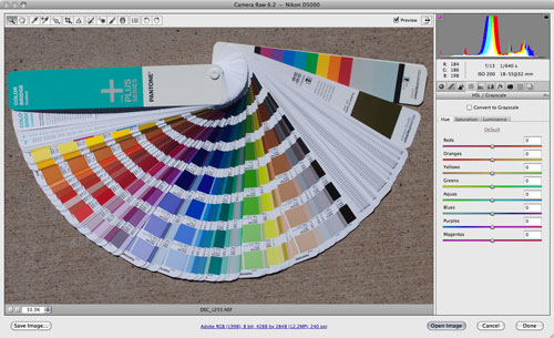
The Pantone Plus Series Color Bridge coated and uncoated set contains solid and CMYK colors with sRGB and HTML equivalents, so they are suitable for users whose work intersects with traditional print and the modern online worlds. These fan guides also have the ColorChecker Lighting Indicator built in, and additionally offer a built-in ColorChecker Primer with HSL (hue, saturation, luminance according to Adobe or lightness according to Pantone) patches directly corresponding to the HSL Sliders in Adobe Lightroom and Adobe Camera Raw software. Once again, these tools are no substitute for calibrated viewing boxes and more powerful calibration devices such as the X-Rite ColorChecker Passport (blatant MyMac review plug), but they are easily portable and simple to implement in the field under fire. Plus Series digital color libraries for Adobe Creative Suite and Quark Xpress are available for download free of charge.
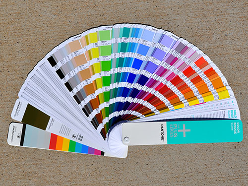
The picture above was shot in bright midday sunshine, and many discussions (not least that the human eye perceives the concrete as white) might ensue from two people examining the image. The image was color balanced using the incorporated ColorChecker Primer. If two people had that Plus Series Color Bridge fan guide to hand, they would at least know that they were essentially looking at the same thing even though they might be half a world apart and communicating by telephone. Below the same shot sits in Adobe Camera Raw awaiting correction, showing the HSL sliders and the corresponding patches on the fan guide.
The Pantone GoeGuide coated fan guide is where color systems are headed for the foreseeable future. Unsurprisingly for something so potentially complex being announced to an established market with long traditions, the Goe introduction was not without some controversies. That’s history now, but some ruffled feathers take longer to settle than others. The Goe system offers a larger number of colors from a smaller number of inks, which at print sites using large volumes of the gooey stuff must surely make the accountants and the stock controllers happy. Goe is a spot color system with an expanded palette and a new numbering system. The decision to adopt the system is not something to be taken lightly, and there is an easy-reading white paper to help with your assessment. Goe digital color libraries for Adobe Creative Suite and Quark Xpress are available for download free of charge from the GoeGuide page.
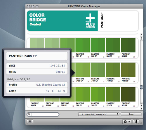
Registering any of these products enables you to download the Pantone Color Manager v.1.0.beta.3 software free of charge. The full release version of the software will eventually be available for purchase, but free for registered users of the color guides. Meanwhile, you may enroll in the beta program and test the software for free without purchasing a qualifying product. The software is still in development, and as new features are added you will be able to update. Rating beta software is a risky exercise, but we can see great potential in this application. We had no problems with the software, and recommend investigation. If Pantone puts its full weight behind this initiative, we can envisage a future where the utility becomes as much a part of the standard software arsenal as the Adobe Creative Suite or Quark Xpress.
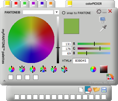
Another free offerings is the myPANTONE v.1.5 palette software (enrollment or product registration required). If you want community inspiration (similar to Adobe Kulur) or need to exchange color palettes with other designers then this might be the software and service that suits you. Frankly, we were unimpressed, but would need to spend more time and perhaps compare the software with the alternative that we already use. The software performed all the functions we expected, so we prefer to think that we are showing prejudice, while hoping that one day the Color Manager will supersede the myPantone tool and incorporate its features.
Why go to all this trouble and expense?
A few advertising buzzwords go a long way for this section: “Select, specify, communicate, visualize, communicate and control.” Well done if you registered the repeated word “communicate,” but we left it in there on purpose because it is so important. If you don’t use these tools to do those tasks, what tools are you going to use? “Green with some blue, but more green than blue”? Can you approve such a color on a computer screen or on a press proof and know for sure your client is going to agree? If you specified a CMYK color in your file, how are you going to check that what you got from the press was that color? These tools should be assessed on how much trouble and expense they can help you avoid.
We like jobs that get completed with no surprises: jobs done right first time, on time, on budget, when everybody gets paid, and everybody goes home on time. It only happens in our dreams, but check if any of these products can help you progress towards controlling the chaos of unmanaged color.
Leave a Reply
You must be logged in to post a comment.