

I recently blogged about a missing feature from iPhoto which lets you burn a CD of photos that is not in iPhoto format, but instead a CD of JPG images that any computer can read and that you could take to the store for developing in a photo machine. Right after I posted that blog, I discovered a way to create an Automator action to do this for you.
Month: October 2007
Macspiration 102
Gefen Wireless 2.0 USB Extender
Review
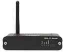
Would you like to have your USB peripherals, especially shared printers, located away from different users’ computers? If so, you should check out this accessory from Gefen, Inc., that allows up to four printers and other USB devices to be located away from your computers.
Read MoreMojo Courier 17″ Computer Case
Review
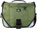
The Mojo by SpireUSA is designed for couriers, bicycle messengers, and active commuters or students with strong shoulders.
Take Control of Upgrading to Leopard: Early-Bird Edition
Review

Leopard is here… are you ready? I know, you’ve been through this before, you’re a power user, know all the tricks that go along with upgrading to Apple’s newest OS… Or you could be a brand new user or ex-Window’s user who’s not really sure what to expect. Well, the crew at TidBits has taken a bite of the process of upgrading and it presents itself in Joe Kissel’s latest endeavor, Take Control of Upgrading to Leopard: Early Bird Edition.
40 Digital Photo Retouching Techniques
Book Review
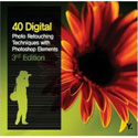
While image retouching might seem like a daunting task, it can be learned and applied with practice. The third edition of Zack Lee’s 40 Digital Photo Retouching Techniques does just that. It demonstrates in easy to follow steps how to use any version of Photoshop Elements or Photoshop CS to retouch or fix good or not so good images. All the techniques are for both beginning and intermediate Photoshop users.
Using iWeb 08
Part 3
![]()
One part of iWeb that you’ll get to know very well is the “Inspector†window. This box is what makes almost all the changes behind the scenes. iWeb relies on this box and its sub-windows for almost everything you’ll need to do beyond dragging and dropping graphics and text boxes. So let’s talk a bit about the Inspector.
MyMac Podcast 151
Leopard

Download the show here, in iTunes, or listen above
A special weekend edition of the podcast looking at Leopard. First up, Tim talks about installing the new Mac OS on both his G5 and Macbook Pro machines. Robert chimes in from his cell phone twice, once about buying Leopard, and again with his first impressions after installing it on an older iBook G4. Finally, John Nemo records four interviews from the Apple store, a really fun segment!
We would LOVE some of your feedback on Leopard. Send us an email here, or simply call 1-801-938-5559 and leave a message.

Subscribe to us in iTunes.
Leopard Arrived
I’m been home sick for the past few days, whatever is going around came to visit me. So this morning, when the FedEx guy
Read MoreMyMac Podcast 150
Waiting for Leopard

Download the show here, rock with iTunes there, or jam above.
By the time you listen to this, Leopard will be out in the wild, possibly even on your hard drive running your Mac. But when we recorded this two days prior to the launch, Tim Robertson, Donny Yankellow, and Rich Lefko were left asking questions and talking about what they were most looking forward to.
As always, we would love to have some feedback. Send us an email here, or simply call 1-801-938-5559 and leave a message.
Subscribe to us in iTunes.
Jam Jacket for iPhone and the iPhone Silicone Case
Video Review

Tim Robertson reviews both the iPhone Silicone Case from USBFever.com and the Jam Jacket for iPhone DLO.com.
Pixelmator
Review
![]()
If you are a regular reader of Mac websites and a listener to different Mac podcasts, you’ve probably heard of Pixelmator. Pixelmator is a new image editing program by Saulius and Aidas Dailde – two brothers that make up the Pixelmator Team. I’ve had the opportunity to try out Pixelmator for a while now (I was allowed to try the beta version), and if you are looking for an inexpensive image editor, Pixelmator is worth a try.
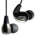
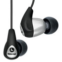
Shure SE 110 Sound Isolating Earphones – Review
Shure, makers of quality sound products such as microphones, and the subject at hand, has yet another offering designed to titillate your sonic fancy: The newly released SE110 Sound isolating Earphones ("Developed for THE PROS" is stamped on the box).
Weekend Archive – Apple, it
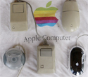
Over three years ago, Bruce Black was calling for a multi-button Apple supplied mouse. This article could have been written today!
MyMac Podcast 149
Beth Lock and John Farr
Download the show here, rock with iTunes there, or jam above.
This week is a can’t miss episode with special guests John Farr and Beth Lock. These two have penned some of the best Mac and non-Mac columns, and Tim, Guy, and Chad talk them up for over an hour. One of the hosts favorite shows to date! Plus, David Cohen’s Fenestration, reader email, and Tim gets the Darth back in his iPhone.
As always, we would love to have some feedback. Send us an email here, or simply call 1-801-938-5559 and leave a message.
Subscribe to us in iTunes.
Data Backup 3.0
Review
![]()
Everyone hates doing backups. I know I do. Like most utility software packages, products like this are ignored until it is too late, and your precious data is gone. It’s funny how diligent I was at work (I suppose my job being at stake had something to do with it…), yet I almost never backed up anything at home. I’ve been playing the odds for a lot of years, and have so far been pretty lucky.
Other World Computing NASPerform Network Storage – Review
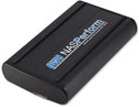
I’ve looked at network storage devices from afar, mostly because of price, and almost all of them were Windows based, but really thought they looked very useful. The OWC NASPerform (NP) utilizes NDAS technology allowing it to connect a storage device directly to a network with or without a server. The prices are pretty good at OWC, and our favorite computer platform is fully supported finally, so it was time for this Mac user to jump in.
Using iWeb 08
Part 2
![]()
Welcome back. In part two of “Using iWeb 08â€, we’ll look at the main screen icons, and what they do.
Shure SE420 Sound Isolating Earphones
Review
SE420 has a lot of punch within the audio spectrum where most music is heard. For $400 you get brilliant clarity throughout this region, without potential aberration from cranium-splitting highs or bowel-churning lows. A lot of money buys a lot of sound delivered to your sonic sweet spot.
Apple opens up the iPhone and iTouch
Apple has decided to deliver a software development program for the iPhone and the iPod Touch in February. This will open the door for
Read MoreDrobo Storage Robot
Review

MyMac.Com has reviewed different large multiple-disk storage products recently. They all share some common traits – multiple disks in an enclosure (USB or FireWire), looking like a large single volume, and some form of RAID technology applied. Next up, the Drobo Storage Robot from Data Robotics, Inc.